
Two Space or Not Two Space
A friend of mine recently posted on Facebook that you could take the second space after a period away from him when you pry it from his cold, dead fingers. I responded with this image of Ben Wyatt from Parks and Recreation.

But I said I’d refrain from sharing my thoughts unless he really wanted to hear them. He said he did, so here goes.
Even though the extra space has its defenders, using two spaces between sentences is wrong by today’s standards, but nearly everybody is wrong about why.
The usual argument goes that it’s a holdover from the days of typewriters. Typewriters use monospaced fonts (meaning that each character takes up the same amount of horizontal space, whether it’s an i or a W), which look spacey compared to proportional fonts (where characters have different widths according to the size and shape of the actual character). Since monospaced text looks spacey already, it was decided that an extra space was needed between sentences to make things readable. But since we’re now all writing on computers with proportional fonts, we should all ditch the two-space habit. Case closed!
But not so fast.
You may have been taught in typing class to type two spaces at the end of a sentence, but the practice has nothing to do with typewriters. It’s actually just an attempt to replicate the look of typeset text of the era. There are other blog posts out there that give a much more thorough account of the history of sentence spacing than I’ll give here (and I’ll link to them at the end), but I’ll use some of the same sources.
But before we dive in, some definitions. Spacing in typography is usually based on the em, a relative unit of measurement that’s as wide as a line of type is tall. That is, if type is set at 12 points, then an em is also 12 points. The name derives from the fact that a capital M in many typefaces is about as wide as it is tall. The em dash (—) is so named because it’s 1 em wide. A space the width of an em is called an em space, an em quad, or just an em or a quad.
An en space or en quad is about the width of a capital N, which is half the width of an em space. An en dash, as you guessed it, is 1 en wide.
A three-em space is not three ems wide but one-third of an em (that is, it’s a three-to-an-em space). Also called a thick space, this is the standard space used between words. There are also smaller spaces like four-em and five-em spaces (known as thin spaces) and hair spaces, but we don’t need to worry about them.
Modern typesetting practice is to use a thick space everywhere, but professional practice even just a hundred years ago was surprisingly different. Just take a look at this guide to spacing from the first edition of what would later be known as The Chicago Manual of Style (published in 1906):
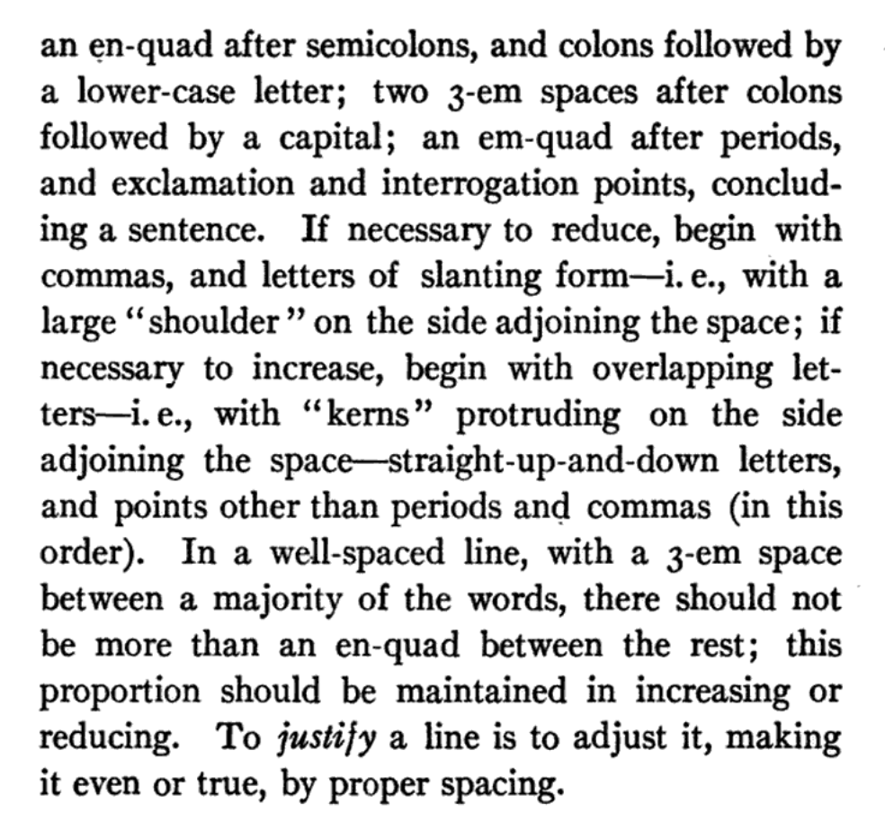
Space evenly. A standard line should have a 3-em space between all words not separated by other punctuation points than commas, and after commas; an en-quad after semicolons, and colons followed by a lower-case letter; two 3-em spaces after colons followed by a capital; an em-quad after periods, and exclamation and interrogation points, concluding a sentence.
In other words, the standard spacing was a thick space (one-third of an em) between words (the same as it is today), a little bit more than that (half an em) after semicolons or colons that were followed by a lowercase letter, two thick spaces after a colon followed by a capital, and the equivalent of three thick spaces between sentences. Typesetters weren’t just double-spacing between sentences—they were triple spacing. You can see this extra spacing in the manual itself:
Remember that typewriters were generally monospaced, meaning that the carriage advanced the same amount for every character, including spaces. On a typewriter, there’s no such thing as a thin space, en space, or em space. Consequently, the rules for spacing were simplified a bit: a thick space between words and following semicolons or colons followed by a lowercase letter, and two thick spaces between sentences or after a colon followed by a capital letter.
At this point the two-spacers may be cheering. History is on your side! The extra space is good! But, again, not so fast.
Around the middle of the last century, typesetting practice began to change. That complicated system of spacing takes extra time to implement, and financial and technological pressures eventually pushed typesetters to adopt the current practice of using a single thick space everywhere. Chicago began using a single space between sentences in 1949, when the 11th edition of the manual was published. But this wasn’t necessarily an innovation. English and Americans typesetters may have used extra space, but French typesetters did not—they used just one space between sentences. Clearly not everyone thought that the extra space was necessary.
And as someone who has done a fair amount of typesetting, I have to say that I’m thankful for the current standard. It’s easy to ensure that there’s only a single space everywhere, but trying to ensure that there’s extra space between sentences—and only between sentences—would be a nightmare even with the help of find-and-replace queries or regular expressions. (I’ve seen some suggestions that typesetting software automatically adds space between sentences, but this isn’t true of any of the typesetting software I’ve ever used, which includes FrameMaker, QuarkXPress, and InDesign. Maybe LaTeX does it, but I’d be curious to see how well it really does.)
My wife has done a fair amount of editing for doctoral students whose committees seem to think that the APA style requires two spaces between sentences, so she’s spent a lot of time putting all those extra spaces in. (Luckily for her, she charges by the hour.) In its section on spacing following punctuation, the Publication Manual of the American Psychological Association says that “spacing twice after punctuation marks at the end of a sentence aids readers of draft manuscripts.” (APA doesn’t require the extra space in published work, though, meaning that authors are asked to put the spaces in and then editors or typesetters take them right back out.)
Unfortunately, there’s no evidence to back up the claim that the extra space aids readability by providing a little more visual separation between sentences; what few studies have been done have been inconclusive. Inserting extra spacing means extra time for the editor, typesetter, and proofreader, and it’s extra time that doesn’t appear to add any value. (Conversely, there’s also no evidence that the extra space hurts.) I suspect that the readability argument is just a post hoc rationalization for a habit that some find hard to break.
After all, most people alive today grew up in the era of single spacing in professionally set text, so it’s what most people are familiar with. You never see the extra space unless you’re looking at an older text, a typewritten text, or a text that hasn’t been professionally edited and typeset. But most people who use the extra space do so not because of allegedly improved readability but because it’s simply what they were taught or because they say it’s impossible to break the habit of hitting the spacebar twice after a sentence.
And I’m skeptical when people claim that double-spacing is hardwired into their brains. Maybe I just have an easier time breaking bad habits than some people, but when I was taught to type in eighth grade (on typewriters, even—my school didn’t have enough money to stock the typing lab with computers), I was taught the two-space rule. And almost as soon as I was out of that class, I stopped. It took maybe two weeks to break the habit. But I already knew that it was an outdated practice, so I was motivated to abandon it as soon as my grade no longer depended on it.
If you’ve been typing this way for decades, though, or if you were never informed that the practice was outdated, you may be less motivated to try to change. Even if you write for publication, you can rely on your editor or typesetter to remove those extra spaces for you with a quick find-and-replace. You may not even be aware that they’re doing it.
Of course, even some people who should know better seem to be unaware that using two spaces is no longer the standard. When my oldest son was taught to type in school a couple of years ago, his teacher—who is probably younger than me—taught the class to use two spaces after a sentence. Even though typesetters switched to using a single space over fifty years ago, and typewriters have gone the way of the rotary phone, the two-space practice just won’t die.
So the real question is, what should you do? If you’re still using two spaces, either out of habit or because you like how it looks, should you make the switch? Or, put another way, is it really wrong to keep using two spaces after half a century after the publishing world has moved on?
Part of me really wants to say that yes, it really is that wrong, and you need to get over yourself and just break the stupid habit already. But the truth is that unless you’re writing for publication, it doesn’t actually matter all that much. If your work is going to be edited and typeset, then you should know that the extra space is going to be taken out anyway, so you might as well save a step by not putting it in in the first place.
But if you’re just writing a text or posting on Facebook or something like that, it’s not that big a deal. At worst, you’re showing your age and maybe showing your inability or unwillingness to break a habit that annoys some people. But the fact that it annoys some people is on us, not you. After all, it’s not like you’re committing a serious crime, like not using a serial comma.
Sources and Further Reading
This post on Creative Pro is fairly exhaustive and rather sensible, but it still concludes that using two spaces is the right thing to do when using monospaced fonts. If the rationale behind using two spaces on a typewriter was to look like typeset text of the era, then there’s no reason to continue doing it.
On a blog called the World’s Greatest Book, Dave Bricker also has a very well-researched and even-handed post on the history of sentence spacing. He concludes, “Though writers are encouraged to unlearn the double-space typing habit, they may be heartened to learn that intellectual arguments against the old style are mostly contrived. At worst, the wide space after a period is a victim of fashion.”

Dawn Loewen
Saving this! Thank you for a clear, readable explanation I can pass on to authors, one with more depth than I’ve been providing.
Daniel Fackrell
I’ll add that for anything rendered to a web page, multiple whitespace characters get collapsed into a single space for display. An exception is made for whitespace SGML entities (such as ), but regular double-spacing after a period doesn’t make the gap to the next sentence any longer.
Bibliovore
I firmly prefer additional post-sentence space to uniform spacing, not from habit but for reader clarity—the same reason I firmly prefer serial commas over their absence. I’ve run into too much text that was made confusing by abbreviations and a one-space rule, especially when combined with proper nouns. For instance:
While that’s certainly not beautiful prose, it’s a real-world example (names changed) that a one-space rule made made needlessly harder to read.
Here, incidentally, is my favorite real-world example of the importance of serial commas:
http://nielsenhayden.com/makinglight/archives/012652.html
kts
Yes, “… 1 p.m. Thursday …” is ambiguous, and extra spacing would be one way to remove the ambiguity. Another way would be to take periods out of abbreviations, leaving them for sentence endings only. The British have been doing just fine with “Mrs Smith” and “Dr Jones” for a couple of centuries now, and they’ve dropped more and more in the last several decades. The Guardian doesn’t use them at all: they write “4pm”, “JK Rowling”, “George W Bush”, “Parmesan vs roquefort”, “Prof John Wells”.
American English is more conservative in this respect, but even here the trend is away from periods in initialisms: most people write “FBI”, including Chicago and the AP, and the New York Times and New Yorker look a bit fuddy-duddy with their “F.B.I.” When other papers reprint New York Times stories, they’ll often remove those periods.
Patrick Neylan
Great stuff, thanks (except for the last sentence, but then, I am English). A company I work for was still using double spaces in its publications till 2008 – the year I walked through the door.
Will-i-am
It should be obvious that double spacing after sentences, double lettering as in letters, and including silent letters in words like subtle, is a conspiracy to sell more paper.
Danae Wulfe
I actually was able to break the habit about five years ago, once I took my writing serious enough to consider publishing. I immediately had trouble with self-editing my work. I went back to the double space, and now just search/replace as a last step before submitting. I don’t really care if I show my age on social media or e-mails.
dtw42
I’ve always felt vaguely uneasy about the typewriter explanation: it just didn’t seem to make sense. Associating the habit instead with the fashions of an older style of typesetting feels a lot more plausible, since I’m familiar with the way older books seemed much more “spacey” in all aspects of their punctuation.
Jonathon Owen
And the typewriter explanation is actually counterintuitive in a way. If all characters have the same width, then a period takes up as much horizontal space as an M. But the period isn’t stretched out, meaning that it has some extra space built in already.
Rosie
I am an English into Spanish translator, born and raised in Mexico. I learned to typewrite in Spanish in the late 60’s. Even back then, when typing in Spanish, we were never taught to use two spaces after a period. It was quite surprising for me to discover the practice in Anglo-Saxon texts. The idea that it was to “aid readability” always sounded fake to me. After all, in Spanish only one space was used, and there were no “readability” problems. To this date, the two spaces still “bother my eyes,” and I feel a need to change them for one. All this to say that I believe it´s a cultural habit, and everybody knows habits die hard.
Noah
If typewriters were generally monospaced, then why was the Chicago Manual instructing people to add em-spaces and en-quads? Sounds like they didn’t have the choice if they wanted.
Jonathon Owen
Chicago was instructing typesetters, not typists. That is, professionally typeset text had extra spacing between sentences, and typists would hit the spacebar twice to replicate the look of professionally typeset text.
Noah
Oh wow and now I know the difference between the two. Thanks for this. Sparks flew in the office this morning as a two-space debate took place.
Kristen Stieffel
Excellent article. Thanks for including the bit about APA style. I’m so tired of explaining that typing two spaces after a sentence has less to do with how old one is than how strict one’s college professors were about APA style.
kts
Fiction has pretty much used a single space between sentences since 1950 or earlier, but wide spacing persisted longer in some genres and publishers. I have several physics and math textbooks published by McGraw-Hill in the 1960s that use a double or triple space between sentences. The latest wide-spaced book I have is An Introduction to Mechanics by Kleppner and Kolenkow (1973) — can anyone beat that? But even McGraw-Hill was in transition by then: I have one of theirs from 1972 that uses single spacing, and Google Books turned up many more from 1974 on.