
Book Review: Shady Characters
 I recently received a review copy of Keith Houston’s new book, Shady Characters: The Secret Life of Punctuation, Symbols, and Other Typographical Marks
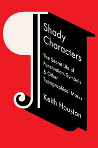
, based on his excellent blog of the same name. The first delightful surprise I found inside is that, in a tribute to medieval manuscripts and early printed books, the book is rubricated—the drop caps, special characters, figure numbers, and dingbats are printed in red. It’s a fitting design choice for a book that takes it readers through the history of the written word.
Each chapter covers a different punctuation mark or typographical symbol, starting with the pilcrow (also known as the paragraph mark, ¶). The first chapter ranges through the beginnings of Greek and Roman writing, the spread of Christianity in Europe, monastic manuscript copying, and the rise of modern typography. Partway through the chapter, I started to wonder where on earth it was all going, but as all the pieces came together, I realized what I treat I was in for. Houston has a knack for turning otherwise dry historical facts into a compelling narrative, picking out the thread of each character’s story while following it down all kinds of scenic side roads and intriguing back alleys.
The rest of the book follows much the same pattern, with trips through the birth of textual criticism in the Great Library of Alexandria, the lasting influence of Roman weights and measures, the invention of the printing press and the birth of typography, the invention of the novel, the standardization of keyboards and telephone keypads, and the beginnings of the internet. And in each chapter, Houston pulls together seemingly unrelated threads of history into a fascinating story of the origin of a familiar typographical or punctuation mark. As an editor and typesetter, I particularly appreciated his lucid treatment of the functions and appearances of the various kinds of hyphens and dashes, including the hated all-purpose hyphen-minus.
Through it all, Houston manages to muster an impressive amount of research (the endnotes take up nearly seventy pages) while keeping the text interesting and accessible. The only part where I got bogged down at all was the chapter on sarcasm and irony, which, unlike the other chapters, focuses on a set of marks that didn’t succeed. It covers various proposals over the years to create a mark or text style to indicate irony or sarcasm. But since it’s an account of failed punctuation marks, there’s an unavoidable sameness to each story—someone proposes a new punctuation mark, it fails to get off the ground, and it’s relegated to the dustbin of history. This isn’t to say that the stories aren’t interesting, just that I found them less compelling than the stories of the punctuation marks that survived.
One other problem is that some of the images are hard to read. I sometimes found it hard to pick out the character I was supposed to see in a faded and tattered Greek papyrus. Increasing the contrast or highlighting the character in question would have been helpful.
Those quibbles aside, it’s a delightful book, full of little gems like this: “In Gutenberg’s day the first rule of Hyphenation Club was that there are no rules.” (Gutenberg’s famous forty-two-line Bible features stacks of up to eight end-of-line hyphens, which would make modern typesetters and proofreaders hyperventilate.) Throughout the book, Houston successfully weaves together history, technology, and design in telling the stories of characters that we’ve seen countless times without giving a second thought to. I highly recommend it to all lovers of typography and the written word.
Disclosure: I received a review copy of Shady Characters from W. W. Norton.
